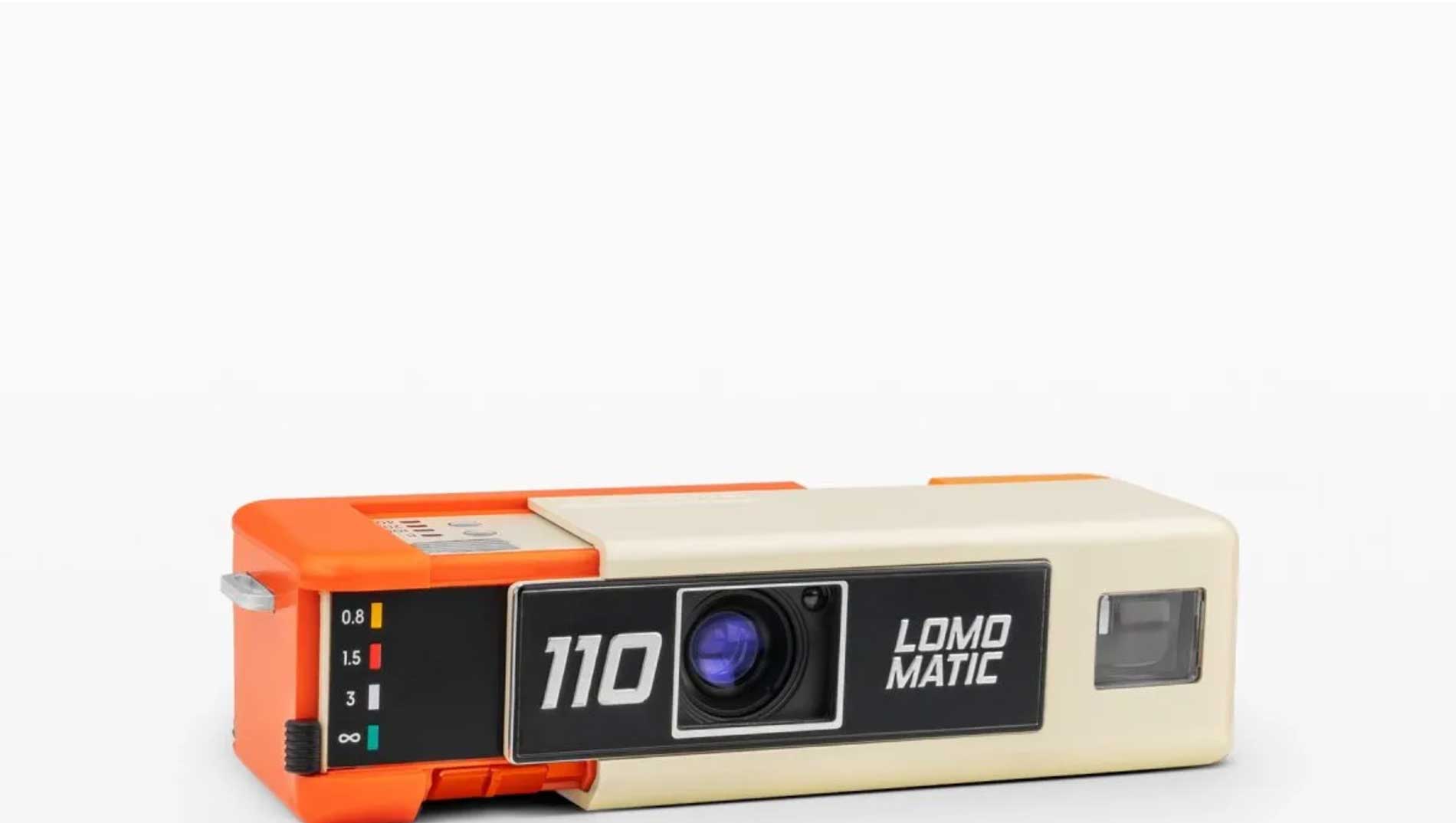
Scattare foto su pellicola come nel 1960 Lomography ha presentato un nuovo modello di fotocamera…

A good designer knows the mystery of colour
What do you know about color? You probably know some basics of color theory: Colors live in a circle, and they’re made of light. Some are warm, and others cool, etc.
In my years as a designer, I’ve often wondered how we came to take these peculiar ideas for granted. Color is often the most salient element of design and perhaps the least understood. How would you explain “red” to the uninitiated? That very question has befuddled philosophers for generations, and you can be sure that I don’t have the answer. For something banal, it’s terribly mysterious.
The first thing you need to know about color is that it’s bigger than you. It’s an ancient language, older than English or Fortran, and almost every creature on earth speaks it. The colors of a coral snake say “I kill.” The colors of a ripe fruit say “I am sweet and nutritious.” Your ancestors may have learned to see colors more than a hundred million years before their first steps on dry land—and they had their damn priorities straight. Colors are powerful symbols by which you live or die; they’re worth paying attention to.

Culture and technology blew up the ways we relate to our surroundings and each other, but color never lost its influence. We use color to indicate when something serious goes wrong or to decide if you can trust a website with sensitive data: Do you think it’s a coincidence that Facebook echoes the color palette of government uniforms? Would you enter identifying personal information on an obnoxiously orange form?

What if Facebook looks orange?
Many digital products are designed to be used by millions of people of every conceivable demographic and personal background, so usability is not something you take for granted. Designers often enlist color to skip over cultural barriers or cut through the noise of busy interfaces. Color lets digital tools speak to you on a subconscious level, more immediate and intimate than words or iconography. Working at scale, color becomes so important that changing it typically requires a compelling theory of action and at least six months of heated debate.
Designers who don’t speak the language of color don’t last long, or worse, they try to express themselves with lengthy think pieces.
So where do colors come from?

Just as a stalactite is formed through the accumulation of droplets that fall one by one in dizzying repetition over time, so mental images of the brilliance of nature or the changing world gradually accumulate to form the names of colors. Some things are lost and others transformed, but finally, without any one being aware of it, color becomes established as a grand system of consciousness. There are probably as many traditional systems of color in the world as there are languages or cultures. — Kenya Hara
Colors don’t have labels in nature. Photons ripple around the world with varying wavelengths, and some of them bounce off objects and wriggle into our eyes. Our eyes can process information from a narrow range of frequencies, which scientists organize along a linear spectrum. Within our eyes, we have several types of cells that react to different ranges within that spectrum, and the mix of signals from these cells gets sent to the back of your head, where vision happens. From there, signals zip to the wrinkly regions around your temples, where you attach a name to the sense data. “Red.”

While most people have the same color-processing machinery in their eyes and brains, there is no universally agreed upon way of looking. The Pirahã, an isolated community in the Amazon, have no words for color and get along just fine. Are you curious what it would be like to not have words for something as primal as color? Well, there are languages that recognize more colors than English, and their speakers actually perceive things we don’t. Russian, for example, categorically separates light blue, “coluboy,” and darker hues, “siniy.” Psychologists have found that Russian speakers can quickly distinguish between shades of blue that, at first glance, would look extremely similar to the average American.
 |
 |
Each culture has its own relationship to color. The Ancient Greeks cared much more about shades of light and dark than hue, leading to phrases that make us scratch our heads today—“wine-dark seas” and “flashing-eyed Athena” in the Odyssey. Did the Ancient Greeks see different colors than we see today? Would an Ancient Greek even understand the meaning of that question?
Cultures tend to develop color vocabularies in similar patterns though. Mutually isolated languages often develop words for “black,” then “red,” and eventually “millennial pink.” Not every language is at the same stage. Whereas Russian juggles multiple blues, Japanese uses one word to capture both blue and green. Others take an altogether different approach. The Himba people of Namibia, for example, see “zuzu,” which includes a range of dark blues, reds, greens, and purples. Not to be confused with “dambu,” which maps to a range of what we might call light greens, reds, and browns. Color is an unfinished project, and there’s more than one way to do it.
There’s also more than one way to understand what color is
We think of colors as distinct entities today, but one can also interpret them as analogies. “The color of wine” works just as well as “red” for most people’s purposes and also plays into a symbolic view of the world common before the scientific revolution. Rather than invisible mathematical laws, you would expect the world to operate by the patterns most visible to you. Aristotle taught that colors correspond to the four elements—earth, air, water, and fire—and I’d wager that some people still believe this. You might reason that if red is the color of Mars, then wearing red will make you a great fighter. Even with the benefit of modern science, symbolic associations take on a reality of their own, often without your noticing. Psychologists found that competitive sports teams wearing red do win more often, though red can also cause one to underperform in solving puzzles.
Before synthetic paints and digital displays, color was inseparable from physical materials. The Ancient Romans obsessed over Tyrian purple, a distinctive pigment painstakingly extracted from vast quantities of aquatic snails at great expense. Its use was restricted to senior government officials, and if you ever saw someone wearing it, you’d probably spit out your coffee and ask for a selfie. And yet, Tyrian purple was never a color in today’s sense; it was a range of purples, reds, and blues bound together by their physical history. The color ultramarine comes from grinding semiprecious stones, and umber comes from processing the earth from the Italian region of Umbria. Burnt sienna comes from burning earth from Siena (also in Italy). The idea of a color, in and of itself, separate from its material provenance, is an entirely modern take. If you couldn’t find it in real-world objects, color did not exist.

We live in a different world now. Never mind synthetic dyes, we have retina displays and anything is possible. Pantone recognizes 1,867 colors, which is about 1,860 more than what we learn in school. I’m pretty sure nobody has actually used “smaragdine” despite it being color of the year in 2013. If you count hex-codes, we have 16,777,216 colors. Of course, that’s over twice the number of colors the human eye is capable of seeing. What are you even supposed to do with that?
We owe the modern understanding of color to one person: Isaac Newton. The same Newton who taught us how to play billiards, brought order to the cosmos, and figured out why things fall down instead of up when you drop them.
Newton noticed that when you send white light through a prism, it splits into a colorful gradient. Not only that, but you could bring colors back together to create white again—this was something altogether new. Before this experiment, mixing colors had been a widespread taboo and an affront to nature. Pigments were unique substances with deep symbolic resonance, after all, and mixing them almost always takes away their vitality. You can imagine what a surprise it was to find a plethora of vivid colors hiding within the white light all around us.

Newton’s rainbow was a perfectly continuous gradient, and he arranged it into neat categories. Newton projected a rainbow onto a wall and had a friend draw lines to divide it into seven colors: red, orange, yellow, green, blue, indigo, and violet. Why seven? Though we know Newton for his contributions to modern science, he was also a product of the 1600s and spent much of his time ruminating about alchemy and ancient mysticism. Pythagoras, who came two millennia earlier, was infatuated with the number seven. There were seven (known) planets, seven notes in the musical scale, seven days of the week, and probably four other examples that illustrate this phenomenon. Newton, for reasons that I’m sure made sense in his time, thought that Pythagoras was onto something. Newton saw color as just another facet of the grand cosmic order and built his own color theory on the seven musical notes of the Dorian mode.

Newton also invented the color wheel. The linear spectrum tells a neat story, but the complete circle reveals a profound order hidden in nature, like musical scales repeating one octave to the next. It also lets you see relationships between colors based on their relative positions in the circle, like how colors opposite one another combine to create white. Nature doesn’t always live up to our ideals through—there is no wavelength of light midway between red and blue. So, we invented purple to complete the circle, mixing red and blue. Color theory, as we know it, is both imposed on nature and inspired by it.
Having been invented by the greatest scientist of all time, color theory was refined by the great artist Johann Wolfgang von Goethe. Where Newton found unity and order in colors, Goethe found conflict. He noticed that some colors clash with one another and are seemingly at odds in some fundamental way. Can you imagine a “greenish red?” Or have you noticed that when you look at a bright yellow object, you might see a blueish after-image?

Goethe also gave us many of our modern ideas about how colors work. It was Goethe who systematically described colors as “warm” or “cool,” a distinction that shapes much of modern design. Of course, this description is more poetic than it is literal—or even universally agreed upon. Earlier generations likely saw blue as a hot color, perhaps because that’s the hottest part of a flame. So much of our perception of color has been shaped by a poet whose work most people have probably never read.
Science started building momentum in the 18th and 19th centuries, and a number of great scientists, engineers, and artists attempted color theory. Many great minds were fascinated by the dream of representing every possible color as a three-dimensional solid, like color wheels drawn out into space. Some people tried stacking together pyramids. Others, like Rungel, developed spheres. Albert Munsell, a professor at MassArt, made a particularly valiant effort to replace our “foolish” words for color with precise coordinates in three-dimensional space. We still use Munsell’s color system in a wide range of contexts today, from classifying hair and skin color in forensics, to getting the perfect color in beer production.
We’ve invented all kinds of shapes to organize colors. Johannes Itten, of the Bauhaus, elaborated on the color wheel and broke color down by seven forms of contrast: hue, value, temperature, complements, simultaneous contrast, saturation, and contrast by extension. Like Newton, he embraced ancient mystical traditions and converted some of his students to Mazdaznan, an esoteric religion described on Wikipedia as a “fire cult.”

More color systems emerged, each more curious than the last. Suzanne Caygill—a one-time club singer, hatmaker, and poet—pioneered personalized color palettes for fashion-forward clients. Robert Dorr organized colors by how they pair with a person’s skin complexion and undertone.
And then there are digital displays. HSL and HSV were designed in the 1970s for new digital tech, and they use cylindrical color spaces. The math behind these models creates paradoxes that defy the way we intuitively see color, so some people carve the cylinders into cones to restrict which colors are possible.
Of course, “possible” means something different now than it once did. We live in the era of pixels, each made of small bands of red, green, and blue. These three primary colors can simulate virtually anything—we call the emergent color a gamut. You may have noticed that these primary colors aren’t the same ones you learned from your Crayola set of red, blue, and yellow. There are no primary colors, except what we choose to treat as such. We’re making up the rules as we go along.

Today we have many color models competing in daily life, because many interdependent technologies rely on rival color spaces …
Today we have many color models competing in daily life, often with different assumptions underlying them and different limits in terms of what can be expressed. Some models, like RGB, leave out quite a few colors in the green space. Others, like CYMK, include colors that we can’t see. Imaginary colors can be seen in extreme cases—like when a perceptual psychologist shows precisely the right color to each eye—but it is highly unusual.
Because many interdependent technologies rely on rival color spaces, we also have reference spaces to compare color profiles against each other. The resulting visualizations are nothing short of exquisite.
The fundamental challenge with mathematizing color is that our perception is both variable and fluid. Some color models have been adapted to better reflect our actual sensitivities to light. Because our color receptors react to overlapping and lopsided distributions of wavelengths—never mind the effects of culture—we see more nuance in some hues than others. The color spaces we can see look more like psychedelic pinecones.
There are other models built entirely around human perception, without regard for the baggage of traditional color theory. The Natural Color System is one such model and starts with the premise of opposing colors in the legacy of Goethe’s color theory.

As a designer, it’s your job to pick colours and convince your boss they’re the right ones …
As a designer, it’s your job to pick colors and convince your boss they’re the right ones. If you work at a large company, you might prepare a 40-page deck to justify your exact choice of hex values. In this strange environment, tools that mathematize colors are flourishing. Adobe’s built amazing features that let you take a photo of anything and extract a representative color scheme. Countless color-palette generators will give you a range of colors precisely chosen for their harmonic relationship—as defined by their exact position in a semifictional color space. It’s convenient and makes you feel like a badass, but it’s also reductive and a bit naïve.
It’s easy to be fooled by the precision of your own tools. We have the notation to describe 17 million colors, but that doesn’t mean we know what we’re doing with them or what they mean to other people. About five percent of us are at least partially color-blind, and each person has their own set of associations and experiences that shape what they see. Cultures vary. Individuals vary. And we still don’t know how to explain what “red” is.
Color is an ongoing project. Technology will continue to improve. Displays will get more vibrant and immersive. Design systems are already paving the way for a more harmonious and color-coordinated internet. Our culture will keep changing, and the ways we interpret colors and the boundaries between them will meander like they always have.
Imagine a world of neural implants that bypass your eyes entirely, feeding you sensory data from beyond the visible spectrum. We’re not terribly far off today. Imagine seeing radio waves a thousand times redder than the reddest red. Or experiencing music as sequences of color filters drifting across your visual field. Newton separated color from physical material, and we may soon separate it from light. René Descartes, Newton’s continental archrival, believed that color was nothing more than a subjective experience without physical reality. We may soon look back to him as the true father of color theory. How will we even begin to make sense of it then?

The next time you load a new website, buy shoes, or pass a flower, take a moment to observe its colors. Look at them from a few angles. Let your eyes relax. Don’t think too much about it. Ask yourself, what do you see?
A good designer knows how to sit with the mystery of color. Designers need to relate to it intuitively and conjure beautiful artifacts from thin air. We also need to rationalize it and make it scalable, accessible, and responsive to market forces. My own method for coping with this dissonance has been to explore older conceptions of color. Between digital endeavors, I make pigments and use materials like wine, tea, soot, iron, copper, and gold. Working with primitive media is a deliberately slow and painstaking process. It brings you into contact with colors as they exist here and now, as physical entities that you can reach out and touch—as many visitors to my studio instinctively do.
Articoli correlati