Inviare un messaggio promozionale è il modo migliore per restare in contatto con i tuoi…

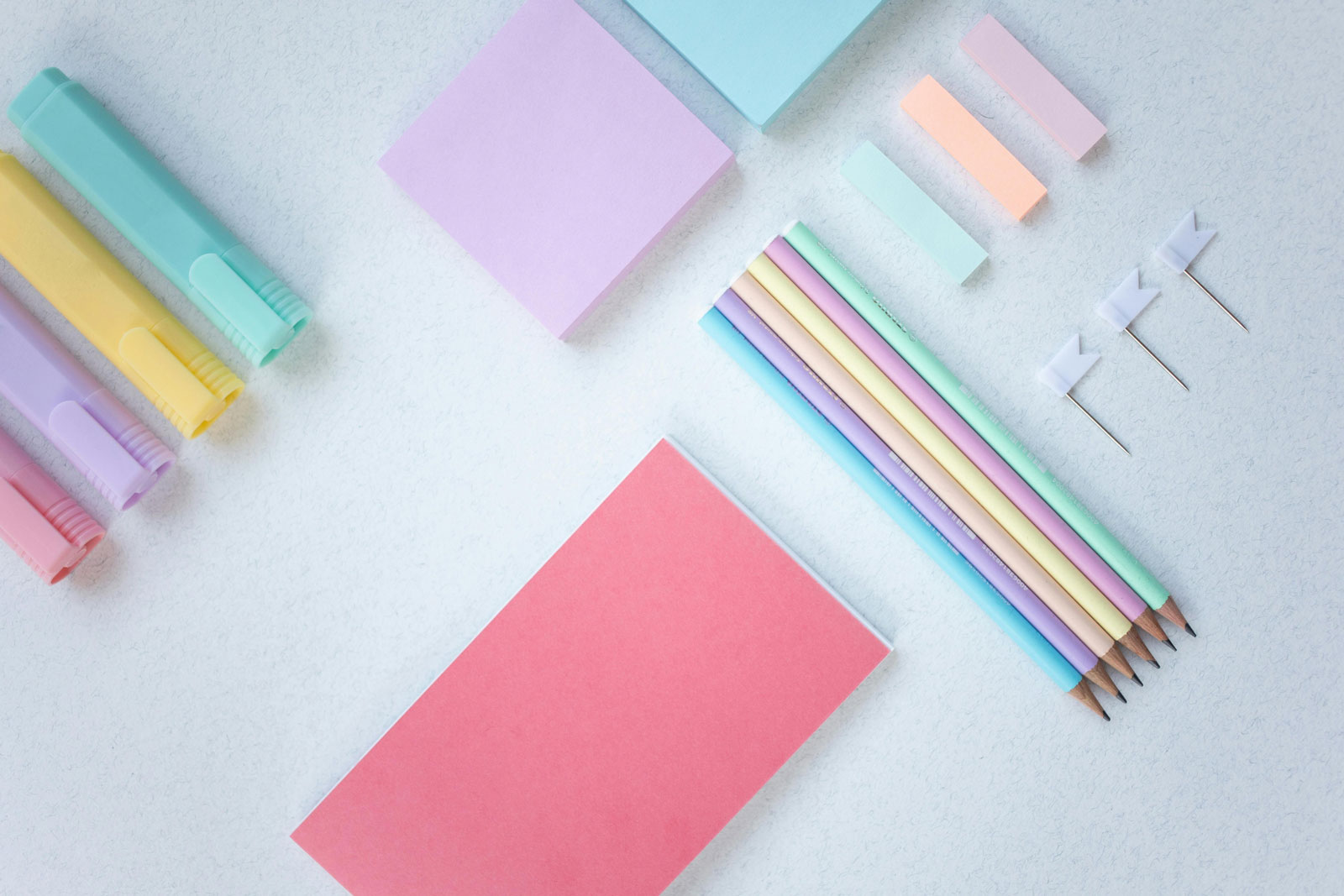
Harness the power of pastel colors
Spring is in the air. Lamb is on the table. The eggs are colored pastel hues. That is to say, everything is as it should be. Yet graphic designers may want to pause and give the season’s designated color scheme a second look.
Pastels are definitely “in” again. Pastel palettes are popping up everywhere—they’re not just for confectioners and greeting card companies anymore.
Just what is the power of pastel? What emotional connotations does it carry, and what is its history in the world of art and design? These questions might help you think through your next project. To find the answers, let’s first figure out exactly what pastels are and how they got linked up with this particular time of year.
Pastel basics

A pastel color is defined as any hue with a high value (lightness) and low to medium saturation (the purity or intensity of the color). That is in fact a pretty wide breadth, meaning more colors are technically pastels than you might have thought. In practice, however, when people say “pastel” they usually refer to a more limited palette including mint green, mauve, coral and robin’s egg blue.
Pastels could be very concentrated and rich, but more often than not, they had a lower saturation of pigment than, say, oil paints. This is likely why the term made the leap from describing a medium to describing an array of light, faded-looking colors.
The spring connection

Many of the images associated with Easter seem pretty random. Bunny rabbits, for one; eggs and chicks, for another. There is no single answer about the reasons for this holiday iconography, but there are histories and theories.
The easter bunny, for one, was likely imported to the United States by 18th century Prussian settlers. Rabbits, known to be prodigious procreators, were a symbol of fertility. Hence they were associated with the renewal of spring and by extension the major Christian spring holiday, Easter. The same logic applies to eggs and chicks. Some people argue that pastel colors partake of this reasoning, too: their high values and low saturations suggest colors just starting to “come back to life” after winter dormancy, before the fully saturated intensity of summer.
 One explanation is that back then eggs were often a forbidden food during Lent, and coloring them was a way of marking the end of this period in a celebratory fashion. As anyone who has tried to dye an egg knows, it is hard to get them very dark. This is another potential reason that we associate Easter with low-saturation pastels.
Whatever the origins of this seasonal color association, it is here to stay, and nowhere is this clearer than in the candy industry that has arisen to capitalize on the holiday. Pastel-hued jelly beans have been an Easter staple since the 1930s, and canary yellow Peeps—for better or for worse, now one of the quintessential Easter foods—came long in the 1950s.
What designers need to know is that all of this fixes pastels to a particular swath of the emotional spectrum, covering optimism, innocence, festivity and delight.
Style Cycles: Why pastels are back

Like anything in fashion, colors go in and out of style. In fact, fashion follows an amazingly reliable sine wave in which styles come back every thirty years, almost on the dot. (People have traced this pattern with skirt lengths back to the early 19th century). This certainly seems to hold true with pastels.
In the 1950s pastels were all the rage in America. People not only wore pastel-colored clothing but decked out their entire houses, from bathroom tiles to kitchen appliances, with it. It handily symbolizes the superficial innocence and optimism of the era.

In the 1980s, another period of exuberance and economic boom, pastels came roaring back. The return was motivated in part by the rise of preppy style, with its powdery polos and sweaters (The Official Preppy Handbook, published in 1980, spelled out the codes of this WASP-y aesthetic). Another instigator was the popular TV show Miami Vice (1984 – 1990), in which the star character, undercover detective James Crockett, literally wore something pastel-colored in almost every scene, often framed against the similarly hued Art Deco architecture of the show’s Miami setting.
Sure enough, here we are in the 2010s and pastels are back again, this time perhaps most pronouncedly in the world of digital design. Pastels are particularly well suited to any website or app that has large empty spaces to fill, because they are easy on the eyes and, as we discussed above, loaded with positive associations.
More
Let’s have a look to these online resources:
- https://www.designwizard.com/blog/design-tips/pastel-colors
- https://colorhunt.co/palettes/pastel
- https://www.canva.com/learn/30-examples-pastel-colors/
Let’s do the job
Which colours? HEX cods? Examples? Here we go:


Articoli correlati